The 'Panic Room' opening title uses landscape establishing shots to create spacial awareness whilst setting the scene. It shows us the movie is set in an American city, New York. The colour of the opening is quite yellow and garish representing the sunshine and bright lights of New York. However there is a dull blue-ish tone over top which signifies a hidden darkness in the city showing that this movie is not a happy movie, and in this case a psychological/action thriller.
Before the clips start there is city noises which tells the audience automatically that we are in a city. The music is low string music which is synonymous with suspense music. It creates a atmosphere of fear. 0:20 is when the music starts. When the title is announced the music gets lower and darker showing us that the movie has an element of horror to it. Afterwards the violins get higher and staccato. This type of suspense music was made famous by 'Psycho' in the clip on the right. It resembles high pitch screaming which plays well with the genre.
The titles are 3D and resemble the New York architecture. It makes them stand out brings attention to the people being announced. It also adds a sense of normality to the scene as they fit in instead of using bring colours to make them stand out.
The first thing in the opening title is the company's titles, in this example it is Columbia Pictures. After this at 0:34 we are announced to the cast.
At 0:50 is the title. It is earlier on like it is in most films as it is one of the most important aspects of the film.
Unlike some films the minor cast are announced separate to the major cast. It creates an unnecessary division between actors but is useful at the main cast are used to promote the film so having them first creates attention.
Like most films the crew are announced after the cast. In this case they are announced from 1:09. Casting is usually one of the first crew members announced and then shortly followed by the costume designers. The costume designers in this film are credited at 1:14. Music directors are normally quite early on and in this case they are announced at 1:18.
The music directors are shortly followed by editors and producers and then at 1:43 the director is credited like what happens in most films.
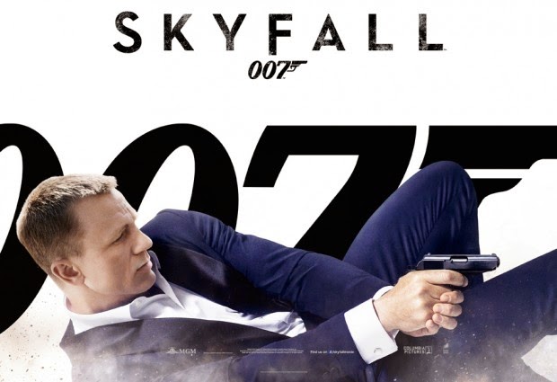
The opening starts with a establishing shot of water to show that Bond is drowning and what his surroundings are like. The light blue gives it a calm effect especially when paired with quiet piano music. The water gets darker and darker to show him drifting away. It eventually fades to black to convey his loss of consciousness.
From that clip on the use of CGI, digital sets and backgrounds are used to create a dream like (or nightmare) appearance. At 0:18 the first set of titles come in introducing the companies who worked on the film.
At 0:21 the first of the main cast are announced. In this still it is dark implying that it could be a nightmare. The use of unrealistic imagery is used a lot in this opening sequence and it starts at 0:20 with a abnormally sized hand dragging Bond down into the sea.
The title is announced at 0:30 and has a different font to the rest of the titles making it stand out. The colours are motifs of the seas as we all associate murky blues with deep water. It makes it more obvious where he is. The lighter colours are more centered around Bond himself making him the focus of the shot.
The rest of the main cast are announced at 0:37. The titles appear slowly stay for a few seconds then fades out again just as slowly. Again lighting is used to frame the center prop in this case the cut out of Bond. The dark rocks to the side frames the titles making them stand out more. The colour red is used to draw attention to the center cut out and we automatically associate with blood and danger so it gives us an idea of the type of movie and the atmosphere. The red flows making it seem quite calm and gentle which is the opposite of what you would think when you see blood.
The next shot fades in from a blur. The woman is a motif of Bond films as they were used in the opening sequences of the older Bond films and that is why you'll often hear the term 'Bond Ladies'. One of the women cast is announced at the same time as this clip which pairs the two. She is rather shadowed creating a dark personality. This gives an idea of the role of women in this film.
The sides of the next clip are blurred out with a tint of unnatural
colours that look like a spectrum. This can be associated with water and
the reflection of light. The large sized weapons give a sense of the
size of danger there is. Again the main source of light is in the
middle creating a frame effect.
After the second main person in the cast is announced (Judi Dench) at 1:06, the music gets louder and the drums kick in giving it more emphasis. The tone goes from peaceful blues to red which is a connotation of blood. It increases the danger factor and creates suspense. The clip is blurred as if it was moving at a fast pace but is still is moving slowly to imply its still underwater.
The co-producers are announced at 1:15 as the red dies down. It takes the emphasis away again but it still is dark creating a tense atmosphere.
'Skyfall' does something unlike most other films I have analyzed and that
is to credit many crew at once and crew that are not normally credited
in the opening scene such as the electrical supervisor. The font is
small implying they are less significant to the main cast who were
credited on their own and in a bigger font. They are announced at 1:24
and the transitions are the same as before - slowly fade in then slowly
fade out.
At 1:32 many crew are announced again including make up and costumes which are typically announced towards the beginning. The title size, font and transitions are the same.
At 1:43 other crew members are announced. We retreat back into the blue water but there is still red flowing creating an artistic effect suited for the artistic crew members such as the Supervising Art Director. The titles are the same.
At 1:58 the amount of crew announced at once are narrowed down to just two making them seem more important as the are separated from the others. The use of 'Bond Ladies' are used again in a dark shadowy scene to imply some sinister at work.
The casting director is announced rather late into the sequence than other films I have analyzed. She is announced at 2:11. The use of red comes back but this time it implies warmth instead of blood through the use of fire. However it still conveys danger. In the back are Chinese dragons which could forewarn about something that happens in China in the film.
At 2:29 typical Bond conventions are used such as the mirror effect, the black and white tone and again the 'Bond Ladies'. The costume director is announced here which is quite late on compared to most movies.
Next to be announced are the editors which typically are near the the end of the opening sequence.
Afterwards the production designer is announced at 2:55. The image reverts back to the image style used when the first crew members are announced.
Music directors are announced at 3:02 and his name is dragged out to make him seem more important.
The title song is announced at 3:14. This is not often done in most movies but since Bond music tends to be a motif for the Bond franchise, it is credited.
The writers are announced towards the end at 3:28. The tone changes back to red to imply danger.
The producers are announced towards the end too at 3:36.
The director, like in most films is the last to be announced. The music slows and quietens down adding emphasis to him. He is announced at 3:46. The titles and the clip fade into black.
Music is key in this opening. It has an almost static feel to it with assorted noises in the background that we could associate with horror such as a heartbeat. The style of the music is somewhat similar to the introduction of 'Counting Bodies Like Sheep' which also has the same sinister feel to it. The music in the opening has a beat to it which is used to sync the titles. This also happened in the 'Sin City' opening. The speed and the sound level increases towards the end making the audience feel as if something is gaining on them. It then ends with a bang once it reaches the climax to scare the audience. The use of music is evoke emotions in the audience and to set the scene for the rest of the movie.
The opening is composed of short close up shots of props or the hands of the character. By using close ups you cannot see the character adding an element of mystery and suspense. It makes the audience wonder who the character is and what is he doing. The clips have a yellow but dark tone creating the illusion of an old rusted setting. It is a good example of the use of colour in a scene. As the scene goes on it seems to get darker and the colour red starts to become more prominent as we start to learn what the character is doing and we know that something evil is at play.
The titles are rough and look handwritten matching the theme of the clips. They are not still and flutter in its place. It looks like they were placed there with a projector giving it a handmade feel to it to match what the character is doing it the clips - making something. The font looks almost scratched on which goes with the several clips where they show the character's mangled fingernails.
At 0:04 the company that made the film are credited. After watching several other openings of films I learned that most film name the company first.
Like most other films the main cast are credited before the crew. In this case they were credited from 0:15. By naming the actors first people who like these actors are more likely to stick around if they know their favourite actor is in it.
Again like most films the title is announced early on in the film. In this movie it is a 0:25. And at 0:31 the main cast are announced. These two things are almost always at the beginning of the opening
scene.
The crew usually are credited nearer the end. The music directors are usually first and in this case they are announced at 1:17. Next was costume design at 1:22 then the editors at 1:25. The director is usually the last person introduced and in this opening it was at 2:04. Putting them at the end makes its more easy for the audience to remember their name and it also puts and emphasis on their name and role.
The first opening I watched was 'Sin City'. The style of the clip resembles a graphic novel, with a monochrome film The first thing you notice in the scene is the music. It first starts with city night ambience before the bass kicks in at 0:06. At 0:10 there is the use of a saxophone which is rather uncommon in thriller but reminds me of jazz music for film noir. The music is more action than suspense but that link with film noir does suggest mystery which often features in thrillers. At 1:18 the music reaches a crescendo when it shows that the movie is based on Frank Miller's graphic novels. This rise in music can be used to show important people in the production of film. The music returns to normal once they introduced the music creators which is a clever way of using their own music to show they are also important. Cello is added to the part where it introduces two of the most important members of the cast - the directors. After they have been credited the music fades out with the screen that fades to black.
Before the credits roll in there is a quick glance at the scenery. The scene fades in from black to a long shot of a woman and a man on the roof of a high-riser. Using this type of shot allows us to see the monochrome city night settings but the red of the women's dress draws the audience's eyes to the middle of the shot where the action is taking place. The red is clever way of showing blood and the death of the woman as well as making it the focus of the scene.
Between 0:02 and 0:06 it zooms out to an establishing shot. The red is barely visible and the focus is gone. We now focus on the settings. We have an aerial view of the city. Though this city is CGI, this type of scene would normally be filmed by helicopter so you can get the flexibility of movement. This type of shot is commonly used at the start of a film so that the audience can get an idea of where the film is placed and if you carefully look at the mise en scene you can also get an idea of what type of movie it will be. At 0:16 it goes from aerial shot to a bird's-eye-view of the city. This is where the title of the movie comes in. Its is cleverly incorporated into the city, using buildings clumped together to mark out the letters. At 0:21 you can see the title fully. Most films tend to credit some of the crew or cast before introducing the title, however in this movie they put it first so they can make it look more interesting with the buildings.
At 0:30 the cast has started to be announced. They use black and white to go with the graphic novel theme but use red for the writing as it stands out over the rest of the shot. It makes the writing look powerful. The images that are used to represent the characters are not still but slowly move left or right, usually the opposite way to the writing. This makes the clip more lively and less boring than it would if it was just still. The use of fade outs make it seem more slow and calm.
At 1:18 it say that Sin City is based on graphic novels and who they were by. This would be useful to mention before the crew because more people are likely to stick around if they know it is based on the graphic novels because they might have read them and it would encourage them to watch the film.
After watch several film openings the casting directors tend to be the first crew members announced. In the Sin City opening they are mentioned at 1:24 before the editors at 1:29. After this there are several more different crew members, usually the producers.
Mainly the music directors are before the actual directors. In 'Sin City' they were announced at 1:33.
I found out after watching many different thriller openings that the director usually is last in the opening title and it was the same in this case.
To get an idea of how most thriller movies start I analysed the opening
to several films on the artofthetitle.com. This way I can get an idea of
how the credits are set out, when the title occurs and what sort of
shots are used to composed the opening scene. From this information, I
can get inspiration and figure out what I want to do for my opening
thriller scene.
Here is a full list of links to my opening titles analysis:
From these analyses I've learned several opening title conventions and these are:
The opening title is compiled from several short clips of either close ups of establishing shots. Humans are rarely featured in opening titles and they are usually made up of props. They are mainly used to set the scene and the tone of the film.
The titles tend to move slowly towards the left or right from the center of the screen. They usually go in opposite directions to each other or the panning shot.
Music mostly features string instruments as they can create an atmosphere of suspense. The bass is usually featured to add a 'heartbeat' effect.
The company is almost always the first thing at the beginning of a movie.
The cast are mostly announced before the title.
The title is always near the beginning of a opening scene.
Casting directors and costume designers are usually the first crew credited.
Music directors are normally one of the three main crew members announced at the beginning. They play with the music making it either come to a stop, get louder or slower when they are announced.
Producers, cinematography directors and writers are announced towards the end.
The director is usually the last person announced.
The music at the end of an opening scene either ends in a bang or fades out.
However these other actors are also good thriller actors and need credit.
Sourced from en.wikipedia.org
Sir Philip Anthony Hopkins, CBE is a Welsh actor well know for the role of Hannibal Lector in 'The Silence
of the Lambs'. He is synonymous with the thriller genre. He has also starred in many other movies such as 'The Remains of the Day' (1993) and 'Shadowlands' (1993). Hopkins has also won many awards such as an Academy Award, three BAFTA Awards, two Emmys and a Cecil B. DeMille Golden Globe Award. He was also was knighted in 1993 for services of his arts and received a star on the Hollywood Walk Of Fame in 2003.
Sourced from en.wikipeida.org
Hawaiian born, Nicole Kidman has worked on several thriller movies such as 'The Others' and more recently 'Before I Go To Sleep'. He start to the acting career was in the 1989 thriller 'Dead Calm'. She is know to portray cold, emotionally vacant characters. Her independent films tend to follow the theme of grief and sorrow such 'Rabbit Hole' (2010). In 2003, Nicole Kidman received a star on the Hollywood Walk of Fame. Later on that year she also received an Academy Award for best actress.
In "Characteristics of a Thriller Move" I talked about a piece of music from "28 Weeks Later" which is also by John Murphy. I wrote that John Murphy is the master of suspense and action music and I think that 'Boathouse' is one of his best pieces. Towards the beginning, like most of his music, it starts quiet and hushed giving us the 'quiet before the storm' effect. It reaches a crescendo to give a sense of action and suspense. John Murphy music in general is rather inspiration when making a thriller movie as it creates a good ambience for any suspense scene or scene of action. His use of bass creates a thumping-like feel to it, almost like the sound of war drums allowing the connection to action. He also uses violins which are also synonymous with thrillers and horrors after the famous piece of music from "Psycho".
Hannibal - NBC
Hannibal is a TV spin-off from the movie "The Silence of the Lambs". The series could be classified as an action/crime/psychological/horror thriller. It does not really fit into one genre. The cinematography is smooth and interesting with different techniques making it a rather inspiring series when you look purely at camera work. However the rest of the series is inspiring. The use of haunting images such as the one below play with the audience's emotion as well as the character's making it an interesting psychological thriller.
Sourced from adventure-naturalist.blogspot.com
It mostly focuses on Will Graham's recurring nightmares and how he snaps from real life to these images of the 'Ravenstag' - which is now known to represent Hannibal Lector.
Sourced from thedailyfandom.com
The rest of the series is seen as a crime thriller as it follows Will Graham as he works for the FBI to solve the cases of the Chesapeake Ripper. The images you get from the crime scenes are horrifying but interesting to the audience.
The mise en scene fits the series perfectly with mostly dark scenes with pops of colour coming from Hannibal's 'meals'. It also includes props that would make us turn away in horror such as the cello through the victim's neck.
This quote is from elucipher.tumblr.com and talks about the use of colour and props:
"Well, Hannibal isn’t the only TV show to have a distinct
aesthetic or to use dense visual symbolism. Many past & present
“prestige dramas”—Mad Men, Breaking Bad, The Wire, Lost, The Sopranos, Boardwalk Empire, Rectify—are
constructed and shot with the same attention to visual symbols and
allusions, framing, lighting, palette, saturation, etc. These seem like
proving grounds for television to perhaps develop its own aesthetic.
But there are many shows that don’t prioritise visual style:
they’re more interested in telling a story, and making the fiction as
natural as possible. Many TV dramas are slick, sleek, gorgeous surface
without much depth; and crime/murder procedurals are particularly guilty
of this; and it’s that’s an approach Hannibal really rejects.
Sourced from zuts.wordpress.com
What’s unusual about Hannibal is that it’s highly stylised
in a way we’d ordinarily associate with cinema. Every frame is
hypersaturated and lush and heightened. There are explicit visual
symbols which shift and develop over the season, e.g. the antlers in the
crime-scene become a stag, then a ravenstag, and finally the wendigo.
It uses a distinct palette of colours: muted browns & blue-greys
punctuated with lurid crimson, purple & yellow. Each shot is
carefully framed; it makes significant use of negative space, light
& shadow; and many of the scenes contain static, vivid, narrow-focus
tableaux vivants (particularly crimes scenes / Hannibal’s feasts).
As Bryan Fuller says, it’s very elegant horror. Hannibal
doesn’t want the act of looking to become unconscious or naturalised,
because that would make the violence too palatable. But it also
reflects the aesthetic of a murderer with a keen and operatic sense of
artistry. So it repeatedly estranges the viewer with this jarring but
beautiful cinematography that foregrounds imagery and symbolism and
visual structures. It has a very dreamy, mythological sensibility. "
This quote is from tillary.wordpress.com and it explains a small bit of how the cinematography is used to the producer's advantage: "This cinematographic illustration of “Will’s Gaze” extends even to scenes where Will is absent.
We can’t really see much of Hannibal’s patient. The strong lighting
is warm and beautiful, like late afternoon, but also creepy and
horror-esque: strong light and shadows, blurred background, peaking
whites. Alluring but sinister. Hard to see. Just like it’s hard to
really see Hannibal, who is the center of the story but also the center
of all the plot and mystery. And of course, no one can really see him
for what he is or the show would be over."
From the series I would take the colour scheme of simple muted colours but exaggerated colours on the main elements of the scene.
"I am a Crisis" - First Aid Advert
In 2012 the British Red Cross released an advert to shock and inspire Britons to learn first aid in order to save someone's life. This is weird place to be getting inspiration from but it is a very haunting advert that does invoke fear into the audience.
The use of a typical night scene in a town with dark shadows but the warmth of street lamps implies normality but the voice over implies quite the opposite. It shows a clip of a family at the end which gives a homely feel but then the women says "I am a crisis, and I don't care who you are". It is a shocking thought and plays with the audience's emotions.
From this I would take the use of the street lamps as it creates the perfect tone for a thriller. I would also take the rough hand-held camera feel to it as it creates a POV effect on tracking shots making the audience feel as if they were the person following.
"Counting Bodies Like Sheep" - A Perfect Circle
From the album eMotive released in 2004, 'Counting Bodies Like Sheep' has a rather sinister but mechanical feel to it and uses different noises to create a rich overlay of sound.
The drums sound almost like approaching footsteps whilst the clicking noises can resemble anything such as a switch being turned on or a lighter being ignited.
The use of human screams and echos add a sinister feel to it. It would create a tense and scary atmosphere for the scene which would be perfect for a thriller movie.
For my opening title I would like to replicate something similar to this with the use of assorted noises overlapping to create the same sort of feel.
'No Church In the Wild' - Filmed by Romain Gavras
In 2012 the song 'No Church In the Wild" by Kanye West and Jay - Z was released. The video is of particular interest as it contain several things I would like to include in my thriller.
The colours are muted and dull showing the settings are not pleasant. The whole video is slow motion creating a calm feel to the chaos in the video. Both of these are something I would like to replicate.
Like in 'Hannibal', the important props are more colourful than the rest of the surroundings. In the video the molotov bomb is a vibrant yellow and red making it stand out compared to the man's clothes and surroundings. It is useful to identify key props in the scene.
Like 'I am a Crisis', it is filmed using a handheld camera creating a rough feel to the scene and shows the chaos. I would like to feature that in my own thriller.